TRA's. Faces and Figures Show this year features 92 works by 41 artists from throughout Tampa Bay. It was a challenge to hang but well worth it! The works go from super abstract paintings to realistic renderings in various media. Check out the video of all the work after the hanging! Vanessa Montenegro was our judge for this year's show and out of 92 pieces she could only select eleven winners.

Vanessa Montenegro is a local Tampa Bay artist who participates in many art shows a year and her work is display in several private collections and public art. She has a studio in Westchase, where she creates her artwork, works on commissioned portraits and teaches art.
Here's what Vanessa had to say about the show, her process and selections:
"Although rewarding, being a juror of an art show is extraordinarily challenging. You are asked to make a very subjective choice, with a very limited amount of time, on a diverse range of media and styles. It is a highly unscientific process, and there is no perfect guide on how to judge an art piece. Ultimately, it comes down to the judge’s knowledge and experience, including an understanding of composition and design; an appreciation of a wide range of styles and media; a good eye for images that manage to connect with the observer; and our own a personal taste.
For the “Faces and Figures Show,” my job was to judge for the first, second, and third place awards, as well as the merit and honorable mentions, with only one award per artist. The show has a wide variety of artwork from the very realistic to the experimental to the quite edgy.
I found the medium of oils, acrylics, and watercolors to be well represented and aesthetically strong. It was extremely challenging for me to narrow down my selections. This is a testament to the quality and creativity of the work that was submitted. There was an abundance of pieces that merited an award, but in the end, I simply ran out of awards. Thank you for showing such outstanding talent.
Standing in front of each piece, I looked carefully at every submission, sometimes several times. So, how did I narrow it down? There are several elements and factors that I took into consideration.
First, I looked at the craftsmanship, technical skill, presentation, and creativity. Is the piece well executed?
Second, I considered the use of color and how the light is captured, as well as its composition, subject matter and medium. Does it convey a mood or message?
Third, I looked at the whole presentation. Has the artist pushed boundaries, broken rules, taken risks or tried something different? Does the piece resonate in some way with me? Does it invite me to explore it further? Does the title hint to the story behind the piece? Has the artist created a style that is markedly his or her own? Would I like to see more work by the artist?


When considering the first place, “Patterns” was my personal choice. This painting is a realistic traditional oil painting. It shows excellent craftsmanship and technical skills. It has a wonderful and emotive rendering of the entire human figure: hands, feet, and face. Great use of colors, and understanding of light, composition, and mood. The artist dedicated a considerable amount of time to the detail of the patterns on the wall, furniture, and a cloth. The painting has a soft, seductive mood. A superb piece to have in a Faces and Figures show.
For second place, I selected “Leather Feather.” This watercolor caught my attention since I entered the room. Its use of color and how it captures the light source is fantastic. The watercolor appears spontaneous and loose with just enough detail around the eyes to bring out the features of the face. The technique is not overdone. Excellent technical skills.
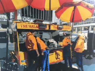
For third place, I selected “Street Food.” The use of a limited but bold color palette against the gray background of the city creates a beautiful contrast. The rendering of the artwork has a graphic design style, which I associate more with acrylics, or a photograph effect on the phone, than with watercolors. This is what caught my attention. Usually, watercolors are used with a softer and more transparent transitions, it was refreshing to see someone use watercolors differently. I like how the piece depicts a contemporary daily urban scene while the people in it did not have definite features that identify them.
For the merit award, I selected three pieces that I really enjoyed. First is “It Gets Better”, a pastel portrait with a fun use of colors and free loose pastel strokes. It would have been wonderful to see this piece in a larger format. My second choice was “Images of Hope #5”, a fantastic watercolor painting. The detail on the kid's features and the layers on the skin are very well executed. Very nice piece. My third choice was “Heather #1”. I enjoyed the work of this artist. He has 3 pieces in the show, and they all represent his style. I like the use of the medium, brush strokes, colors, and the simplicity of the artwork.


One of my goals as a juror was to look at the diversity of the mediums and styles that I observed as an outside witness. For the honorary mentions, I selected five pieces that would represent different mediums and styles. “Morning Market” is a great example of atmospheric perspective. The building going back with the cloth hanging from building to building creates a great sense of space. I like the use of color jumping from the people’s coats in the foreground to the background, enticing the viewer to keep looking.

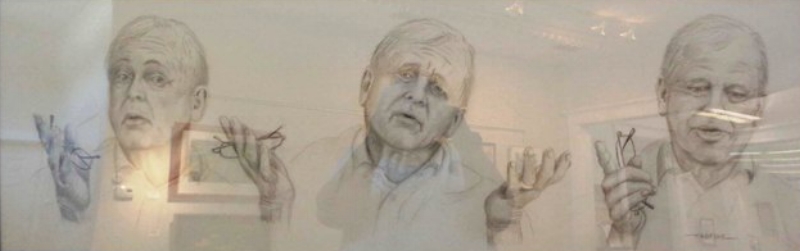


“The Storyteller” is a pencil drawing done in a sketch style. What I like about this piece is the different face and hands expression as the man tells his story. This piece is not about one moment in time but a series of moments that capture the story. “Day Dreaming Jolie” is a digital picture. I like how the artist presented this media. It looks professional and contemporary. Very different to other artwork in the show.
“Miss Olivia” is painted beautifully. The layer of colors on the skin, the baby features, and its expression are very well executed. I also like the contrast of the face against the dark background. Finally, the “Turner Look.” While the same artist who painted the “Turner Look” also had another large and nicely rendered painting, I selected this one because of the playful brush strokes, the understanding of light and, especially, for the boy’s dual expression. Either he is innocent or not at all. Very cute and well done.
I want to congratulate all the artists who participated in the show. I want to encourage the artists who did not get an award to continue to believe in their work. The jury processes is not an exact science, but it is a time-honored method for artists to receive feedback and measure their progress. Again, I can only encourage artists to continue to submit works to shows such as this one. Finally, I want to thank the Tampa Regional Artists for the lovely hospitality and for the invitation to select this show."
If you have not come down yet to see this show, it is not too late! We are open 12-3 PM Tuesday through Sunday. You can see what we post of the many works on Facebook but it pales in comparison to seeing it in person. Plus, it'll only be up until next weekend when we receive for our next show Fin, Fur, and Feather.