Photography and Digital Media Show 2017: Judging Results

jim_swallow_portrait.jpg

This year's Photo and Digital Media Show was judged by local photographer Jim Swallow, who has been doing photography since 1972. Jim and his wife Cheryl created the Photographic Art Society  in Tampa Bay to "encourage other photographers in their quest for artistic excellence." He is a PPA Certified Professional Photographer, member of the Tampa Area Professional Photographers Association, Professional Photographers Guild of Florida, The Florida Professional Photographers Association, and The National Association of Photoshop Professionals.

Here's what Jim had to say about this year's show:

The photography exhibit this year had a lot of great images making it very difficult to decide. It is great to see photographic artists of all skill levels enter and show their work in a gallery environment. Many of you will be inspired by the images and will continue to grow as artists. The image I chose as first place stood out from the very beginning with striking color and a bold presentation. Second place was an animal portrait that showed it’s personality, the focus was perfect the emphasis was where it needed to be. The third place image starts you on a journey at the top and leads you to the prize at the bottom.  All the image that received awards tell a story and move the viewer. It is important when creating images that you move the viewer and most of the images did. I encourage all of you to continue your pursuit of creative photography and learn from the experience of entering and showing your work and strive each time to create images that move the viewer.

Thank you
Jim Swallow

Congratulations to our winners!

First Place: "The First Breakfast" by Jojhan Castillo

"The First Breakfast" by Jojhan Castillo

John Guiseppi_2nd.jpg

Second Place: "Anhinga" by John Guiseppi


Third Place "Marjorie's Garden" by Christa Joyner Moody

Christa Joyner Moody Photography: Earth, Wind, Fire and Water &emdash; IMG_2395

Glen Depasse_HM.jpg

Honorable Mention: "Copilot" by Glen Depasse


Honorable Mention:
"La Catrina" by Jose Rosello

Jose Rosello_HM.jpg

Derry MacDonald_HM.jpg

Honorable Mention:
"Art on the Beltine" by Derry MacDonald

2017 Fin, Fur and Feather Show: Judging Results


Our annual animal kingdom themed show presents 102 pieces from local artists in Tampa Bay, featuring all media. The judge certainly had a challenge in selecting winners out of such a diverse mix of talent! The judge for this year's Fin, Fur and Feather Show is local Tampa artist Joan L. Garcia. She is a member of the North Tampa Art League and Oil Painters of America. Joan's painting "Tampa Bay Tarpon" was selected for the first ArtPop Tampa, a competition organized by the Arts Council of Hillsborough County and hosted by OUTFRONT Media where winner's artwork was featured on billboards throughout the Tampa bay area. 

Judge Joan Garcia with her "Tampa Bay Tarpon" on an Artpop billboard.

Judge Joan Garcia with her "Tampa Bay Tarpon" on an Artpop billboard.

This is an exceptionally diverse show that accurately represents the title and subject matter. There is much to educate and entertain the art viewer. The various mediums present an exciting selection of the art talent in the Tampa Bay area.

Joan L. Garcia


Presenting the winners and feedback from Joan:

Focused by Linda Reynolds

Focused by Linda Reynolds

FIRST: 
Focused by Linda Reynolds

The first thing that garnered my attention in this painting was the depth of field. The artist was masterful in the use of defused “focus” to draw the attention to the bird. Then the viewer is attracted to the detail, accuracy and beautiful strokes of the bird itself. The warm color tone of the painting gives it an old world feel and makes it stand out among the surrounding works.  


Anhinga Love Knot by John Guiseppi

Anhinga Love Knot by John Guiseppi

SECOND: 
Anhinga Love Knot by John Guiseppi

This is a beautifully executed colored pencil piece. The various tones of black, blue and gray give a wonderful depiction of this particular bird. The detail of the feathers and reflected light show the artist’s effort to make an extremely accurate wildlife drawing.


THIRD: 
Stephanie by Steven Mullins

This small scratch board piece kept demanding my attention from the surrounding pieces. Of course the contrast of dark and light is striking, but the composition and detail captures the viewer’s interest. The delicacy of the strokes enhances the representation of the fur and the artist’s ability to capture the cat’s eyes in this medium is incredible.


AWARDS OF MERIT:

Front Gate by Joose Hadley

Beautiful strokes and movement in this painting. While the horse is the main subject the composition draws the viewer into the whole story of the painting. The value of the background versus the vibrancy of the main characters enhance their action.

Coral Rest by Ron Deel

The bright primary color contrasts make this a compelling piece with great depth and good value. The painting/stroke quality gives it an interesting contemporary look.

Cheetah Sunset by Randy Matthews

Not the ordinary photo of a wild animal. The digital enhancements enliven the cheetah. Also the horizontal background waves contrasts with the graphic nature of the cheetah’s coat.  

White Egret Prowl by Donna Morrison

Beautiful use of color contrasts to capture the essence of this heron on the hunt. The movement of the watercolor keeps the painting alive around the white bird. The reflection of the bird provides a striking element of the composition.


HONORABLE MENTIONS:

It’s Not About the Cat by Margret Thomas

The use of light and value is exceptional in this painting and the elevated point of view sets it off from the rest. Though the vase is the strong color in the painting, the artist uses diagonals to draw the viewer’s eye to the cat.

School of Fish by Judy Pence Milsaps

The graphic design of this small painting draws the eye to capture the fishes’ habits. Despite the partial subjects the artists keeps the viewer’s eye moving within the painting with the background actually providing the color.

Seriously by Deborah Biasetti

The unique monochrome of the subject as well as the artist’s ability to capture the comedic quality of this particular bird made for an interesting painting. The vibrancy of the watercolor strokes adds to the personality.  

Bear in the Woods by Gina Stark

The symmetry of composition, color contrasts and layering as well as the primitive look make a compelling painting.

Red Tails in the Sunset by Clarita Scioscia

The strokes of this painting really intrigued me along with the color and value combinations.

Faces and Figures Reception

This year's Faces and Figures Show reception on July 13th was a success. Many awards were presented to the respective winners and we concluded with a presentation on framing with Lauren Ireland from Dick Blick in Tampa. President Kathy Durdin mentioned that this was the largest of our themed shows of the year with 92 works from 41 artists. So much so that we had to increase the amount of awards from our usual six awards to eleven!

Congratulations go out to all our winners and everyone for the fantastic work on display. Thanks goes out to our wonderful hanging committee volunteers for receiving and hanging all the artwork. 


Faces and Figures: Winners and Judge's Thoughts

TRA's. Faces and Figures Show this year features 92 works by 41 artists from throughout Tampa Bay. It was a challenge to hang but well worth it!  The works go from super abstract paintings to realistic renderings in various media. Check out the video of all the work after the hanging! Vanessa Montenegro was our judge for this year's show and out of 92 pieces she could only select eleven winners. 

About Vanessa MontenegroVanessa Montenegro is a local Tampa Bay artist who participates in many art shows a year and her work is display in several private collections and public art. She has a studio in Westchase, where she creates her artwork, wor…

Vanessa Montenegro is a local Tampa Bay artist who participates in many art shows a year and her work is display in several private collections and public art. She has a studio in Westchase, where she creates her artwork, works on commissioned portraits and teaches art.

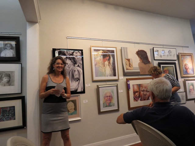
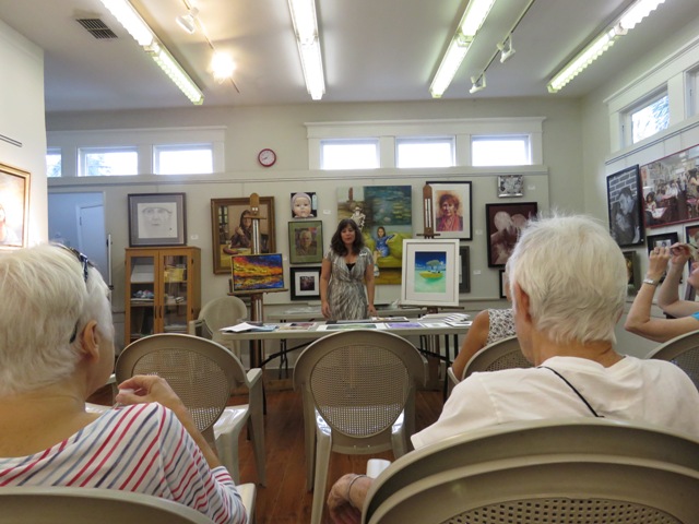
Here's what Vanessa had to say about the show, her process and selections:

"Although rewarding, being a juror of an art show is extraordinarily challenging.  You are asked to make a very subjective choice, with a very limited amount of time, on a diverse range of media and styles.  It is a highly unscientific process, and there is no perfect guide on how to judge an art piece. Ultimately, it comes down to the judge’s knowledge and experience, including an understanding of composition and design; an appreciation of a wide range of styles and media; a good eye for images that manage to connect with the observer; and our own a personal taste.

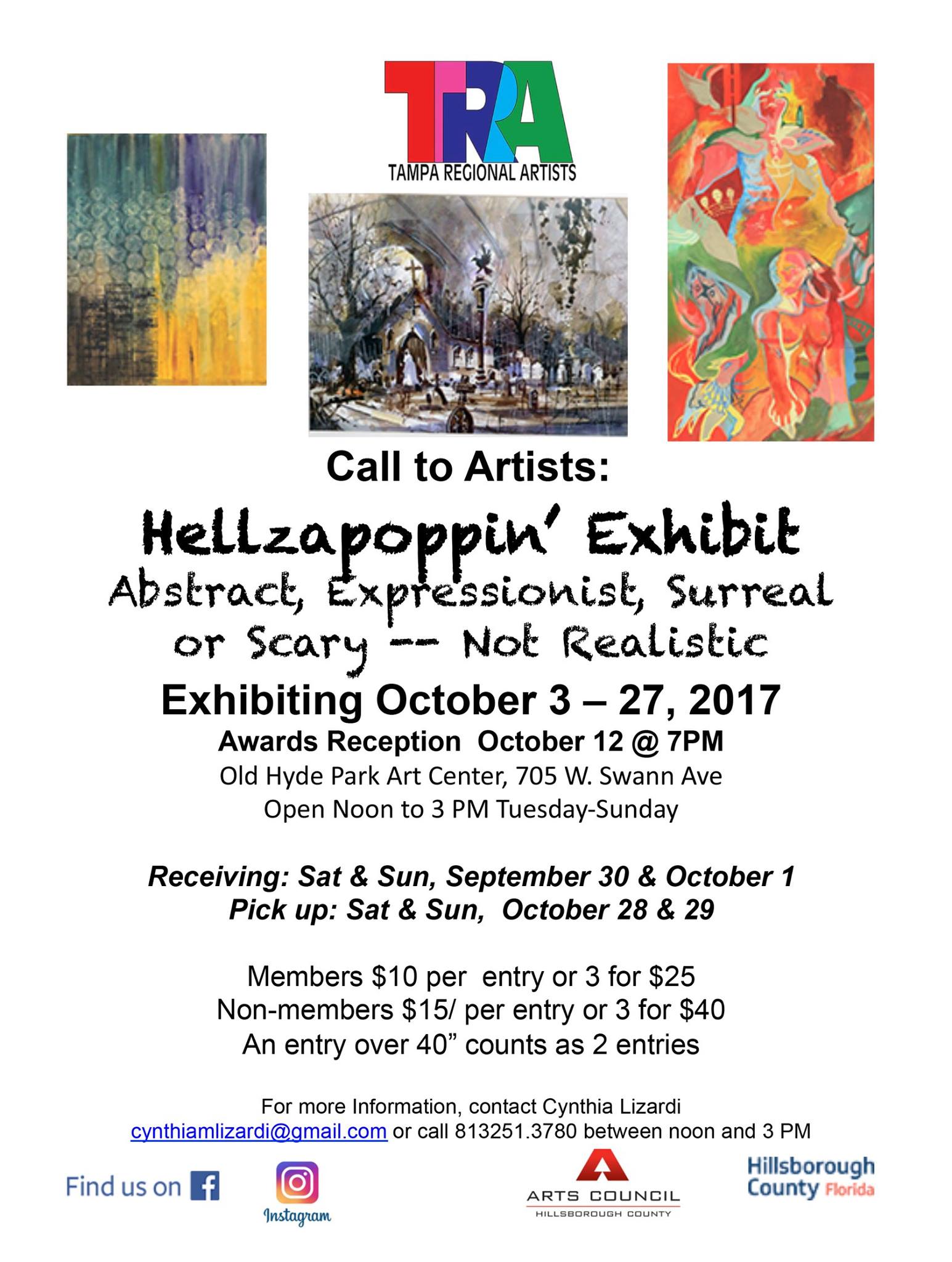
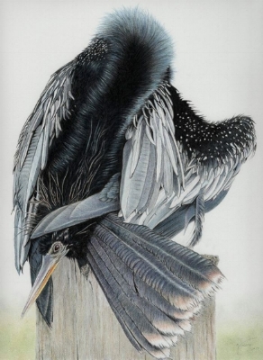
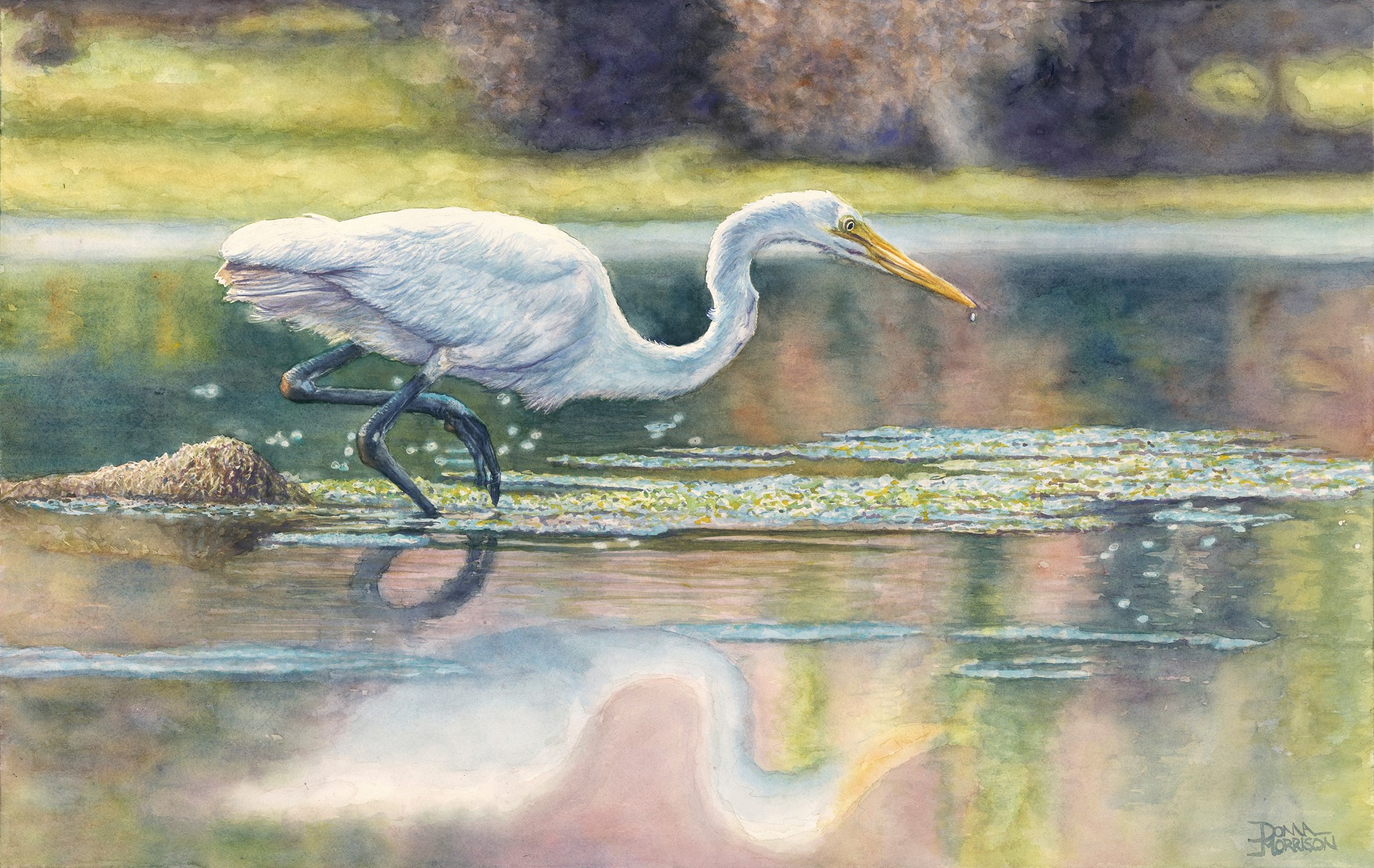
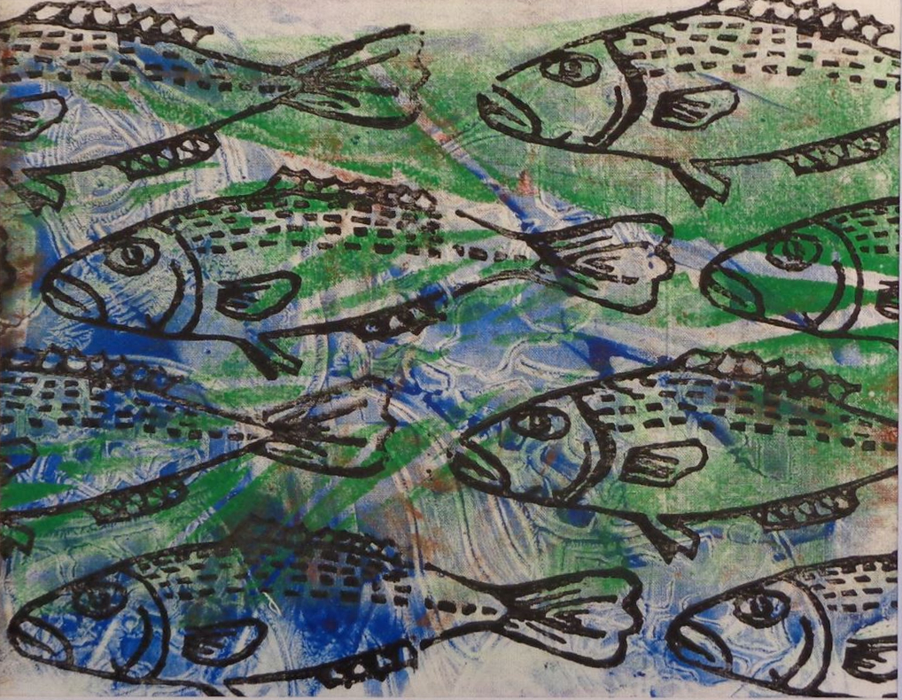
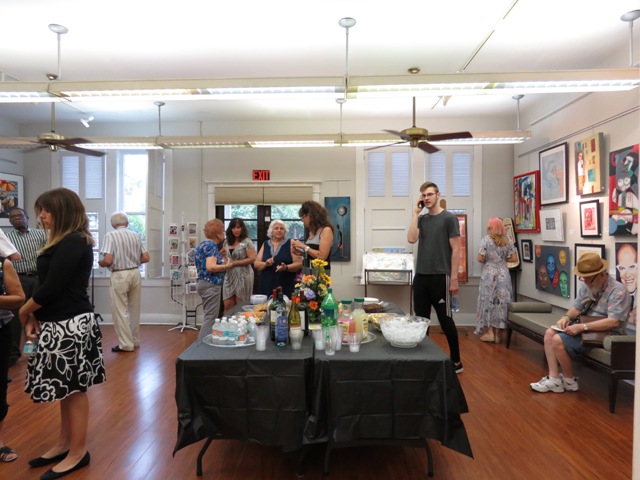
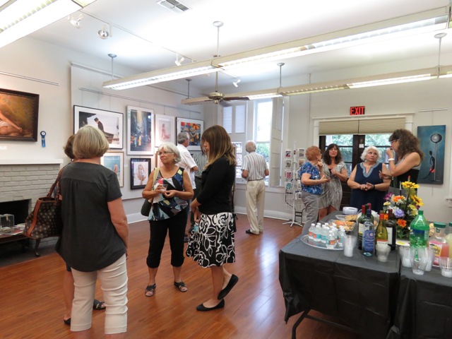
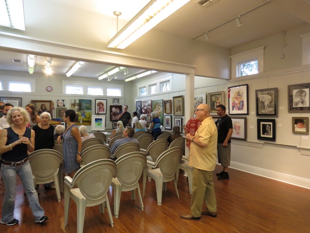
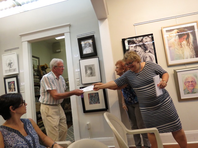
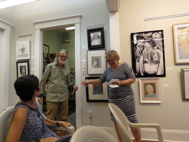
For the “Faces and Figures Show,” my job was to judge for the first, second, and third place awards, as well as the merit and honorable mentions, with only one award per artist. The show has a wide variety of artwork from the very realistic to the experimental to the quite edgy.  

I found the medium of oils, acrylics, and watercolors to be well represented and aesthetically strong.  It was extremely challenging for me to narrow down my selections.  This is a testament to the quality and creativity of the work that was submitted.  There was an abundance of pieces that merited an award, but in the end, I simply ran out of awards.  Thank you for showing such outstanding talent.

Standing in front of each piece, I looked carefully at every submission, sometimes several times. So, how did I narrow it down? There are several elements and factors that I took into consideration.

First, I looked at the craftsmanship, technical skill, presentation, and creativity.  Is the piece well executed?

Second, I considered the use of color and how the light is captured, as well as its composition, subject matter and medium. Does it convey a mood or message?

Third, I looked at the whole presentation.  Has the artist pushed boundaries, broken rules, taken risks or tried something different? Does the piece resonate in some way with me? Does it invite me to explore it further? Does the title hint to the story behind the piece? Has the artist created a style that is markedly his or her own? Would I like to see more work by the artist?

When considering the first place, “Patterns” was my personal choice. This painting is a realistic traditional oil painting. It shows excellent craftsmanship and technical skills. It has a wonderful and emotive rendering of the entire human figure: hands, feet, and face.  Great use of colors, and understanding of light, composition, and mood. The artist dedicated a considerable amount of time to the detail of the patterns on the wall, furniture, and a cloth. The painting has a soft, seductive mood. A superb piece to have in a Faces and Figures show.

For second place, I selected “Leather Feather.” This watercolor caught my attention since I entered the room. Its use of color and how it captures the light source is fantastic. The watercolor appears spontaneous and loose with just enough detail around the eyes to bring out the features of the face. The technique is not overdone. Excellent technical skills.

For third place, I selected “Street Food.” The use of a limited but bold color palette against the gray background of the city creates a beautiful contrast. The rendering of the artwork has a graphic design style, which I associate more with acrylics, or a photograph effect on the phone, than with watercolors. This is what caught my attention. Usually, watercolors are used with a softer and more transparent transitions, it was refreshing to see someone use watercolors differently. I like how the piece depicts a contemporary daily urban scene while the people in it did not have definite features that identify them.

For the merit award, I selected three pieces that I really enjoyed. First is “It Gets Better”, a pastel portrait with a fun use of colors and free loose pastel strokes. It would have been wonderful to see this piece in a larger format. My second choice was “Images of Hope #5”, a fantastic watercolor painting. The detail on the kid's features and the layers on the skin are very well executed. Very nice piece. My third choice was “Heather #1”.  I enjoyed the work of this artist. He has 3 pieces in the show, and they all represent his style. I like the use of the medium, brush strokes, colors, and the simplicity of the artwork.  

One of my goals as a juror was to look at the diversity of the mediums and styles that I observed as an outside witness. For the honorary mentions, I selected five pieces that would represent different mediums and styles. “Morning Market” is a great example of atmospheric perspective. The building going back with the cloth hanging from building to building creates a great sense of space. I like the use of color jumping from the people’s coats in the foreground to the background, enticing the viewer to keep looking.

“The Storyteller” is a pencil drawing done in a sketch style. What I like about this piece is the different face and hands expression as the man tells his story. This piece is not about one moment in time but a series of moments that capture the story. “Day Dreaming Jolie” is a digital picture. I like how the artist presented this media. It looks professional and contemporary. Very different to other artwork in the show.

“Miss Olivia” is painted beautifully. The layer of colors on the skin, the baby features, and its expression are very well executed. I also like the contrast of the face against the dark background. Finally, the “Turner Look.” While the same artist who painted the “Turner Look” also had another large and nicely rendered painting, I selected this one because of the playful brush strokes, the understanding of light and, especially, for the boy’s dual expression. Either he is innocent or not at all. Very cute and well done.

I want to congratulate all the artists who participated in the show. I want to encourage the artists who did not get an award to continue to believe in their work. The jury processes is not an exact science, but it is a time-honored method for artists to receive feedback and measure their progress. Again, I can only encourage artists to continue to submit works to shows such as this one. Finally, I want to thank the Tampa Regional Artists for the lovely hospitality and for the invitation to select this show."

If you have not come down yet to see this show, it is not too late! We are open 12-3 PM Tuesday through Sunday. You can see what we post of the many works on Facebook but it pales in comparison to seeing it in person. Plus, it'll only be up until next weekend when we receive for our next show Fin, Fur, and Feather.